No doubt, the most popular topic of the next 3 months (maybe 6) will be iPhoneX and related issues to applications development, especially designed for this device. I could not escape from the temptation to write something on the subject.
The following article is about my personal experiences and considerations spending the last couple of weeks to upgrade some customer applications to Apple’s new iPhone X guidelines.
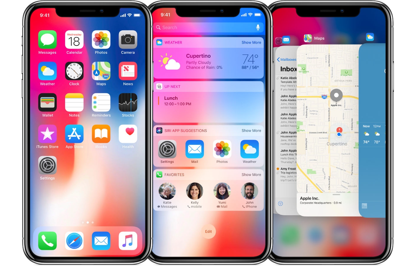
When creating something, it is important to have a clear and concrete vision of what needs to be done. However, to have a clear and concrete vision of iPhone X you need to hold it in your hand and work with it. Fortunately, the Xcode 9.1 simulator plays a good part of this task and even without being able to put your hands at day 1 on Apple’s new flagship, you can still know what to do.
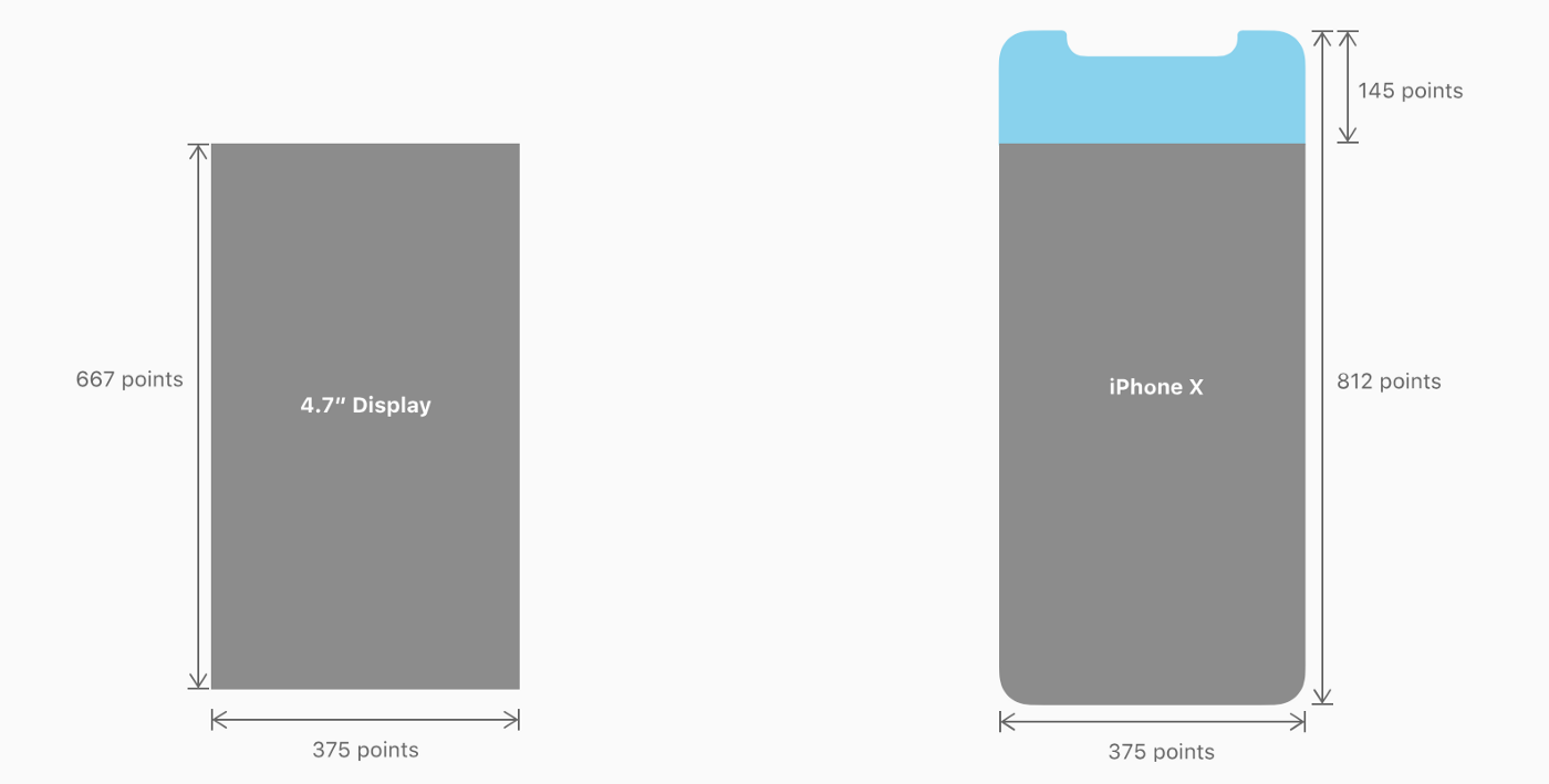
It is clear that the new device has a more visible area — about 12% more — than its predecessor (iPhone 8). At the same time it inherits the width of 375pt but not the height.
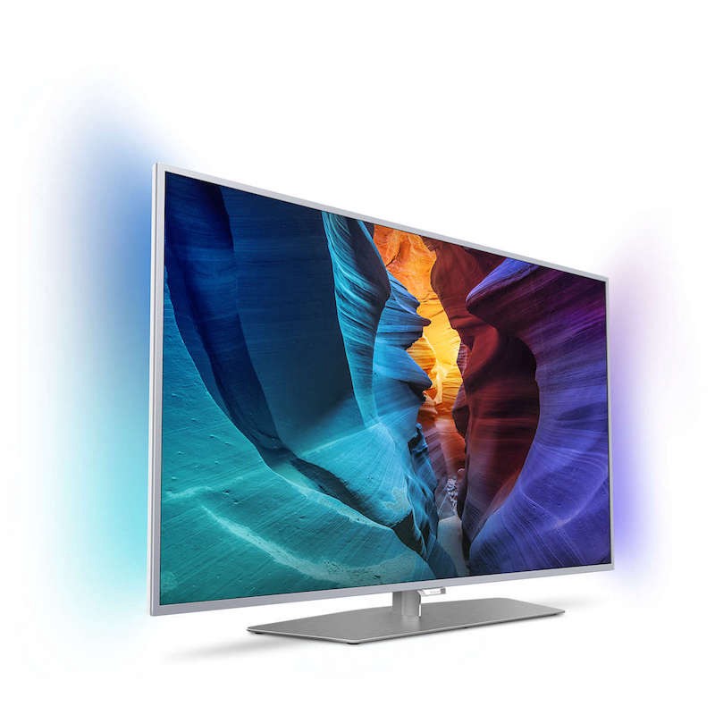
When I have to talk about this topic during a technical conference, I like to start with this concept of a larger screen portion that maintains the same visible area. A couple of years ago Philips created something real innovative by delivering the first TVs that emitted a soft light on the background to mimic the screen light with the ambient light.
What? Why is this interesting? We are talking about Apple and iPhone X! What this means? Are you serious? Absolutely!
Philips engineers exploited near or para-central peripheral vision to increase the cognitive perception of the scene on the screen.
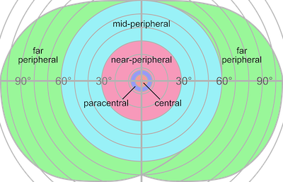
As noted by Strasburger, Rentschler and Jüttner in Peripheral Vision and Pattern Recognition: A review — Journal of Vision (2011), the para-central vision provides the brain with an immediate peripheral vision that contributes to the release of sensations that create the background of a detailed visual perception.
Short and simple version: using a delicate contour surrounding a precise detail, helps to focus more attention on the details. I think that this concept is the closest thing to what Apple and iOS designers thought when they studied and realized the interface guidelines that create the iPhone X experience.
What this mean for the developers and architects of a mobile iPhone app? If you’ve kept yourself up to date, studying the latest news coming from WWDC 2017, then you’ve probably heard about Safe Area. It’s time to connecting the dots: concepts that were abstract a few months ago, now count within the new Apple device and its design guidelines. Nothing was left to chance.
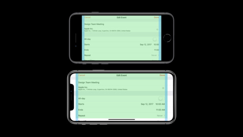
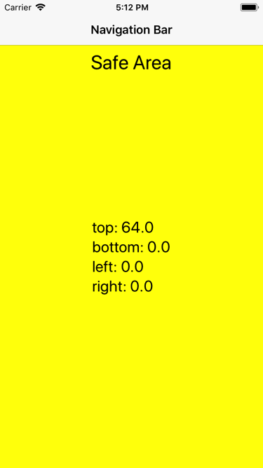
With iOS 11 Apple has introduced the Safe Area concept to replace the Top and Bottom layout guides.
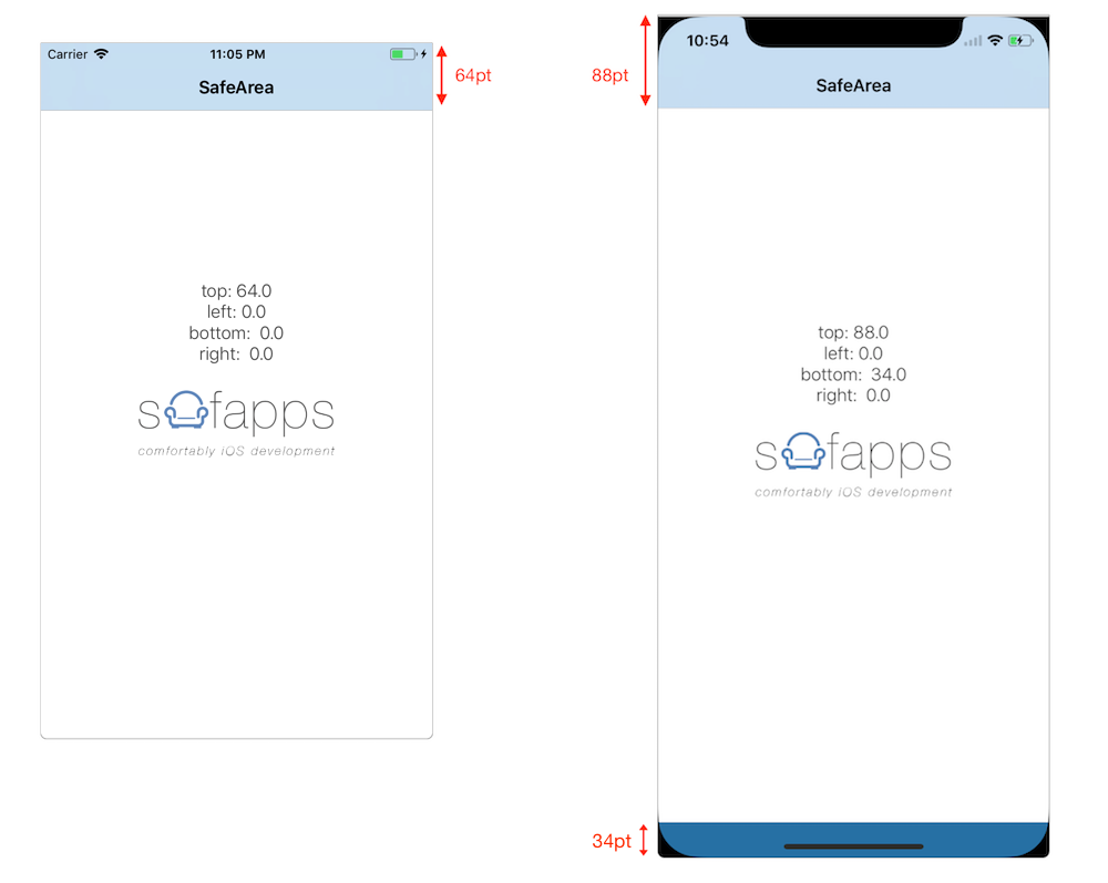
Here’s how the safe area (the one in white) appears in a hypothetical application on iPhone 8 (left) and on iPhone X (right). As you can see, in addition to being a wider area that extends to the top area (topAnchor), there is also a 34 points bottom area (bottomAnchor) underneath a control zone that works as the alternative to the lack of Home button. Let’s take a close look:
-
667pt — 64pt = 603pt (visible height area on iPhone8)
-
812pt — 88pt — 34pt = 690pt (visible height area on iPhone X)
The concept becomes even more interesting if we move to the landscape. In this condition, regardless of whether the sensing zone (notch) is right or left, both margins are re-entered with an inset of 44pt.
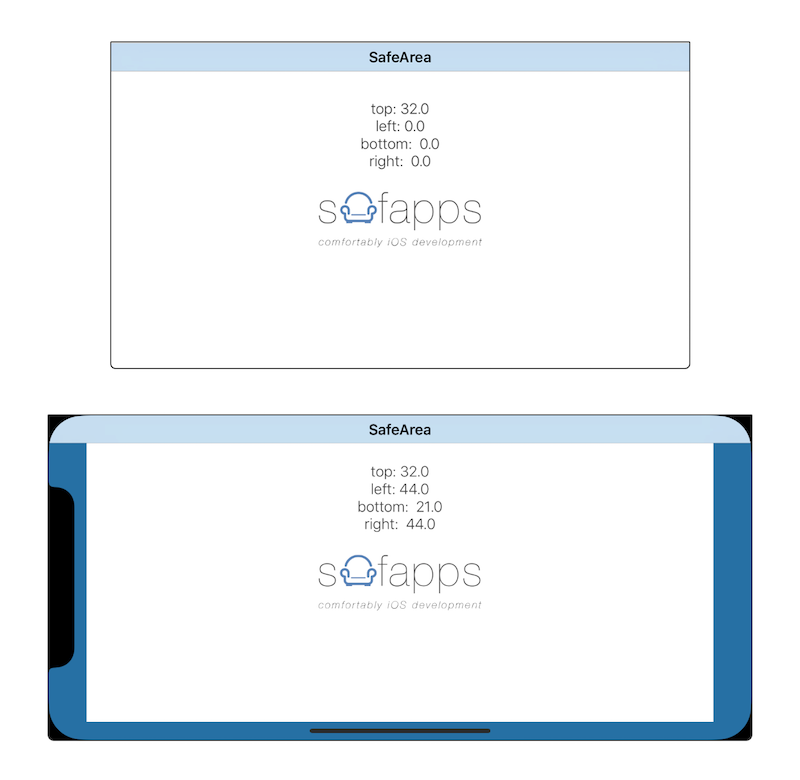
Note that as in the case of iPhone X, landscape height is no longer similar to that of iPhone 8 (375pt) but is somewhat smaller due to the control zone for replacing the home button:
-
375–32–21 = 322 (landscape height on iPhone X)
-
375–32 = 343 (landscape height on iPhone 8)
and if we make the ratio:
-
(667/343) ~= 1,9 (width:height ratio on iPhone 8)
-
(724/322) ~= 2,25 (width:height ratio on iPhone X)
This means that the two devices have different relationships, and hence a full screen image in the background, for example, on the two devices must be handled properly in order to deliver the same user experience.
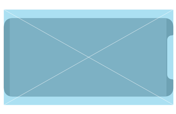
This is what would happen if a device with the height / width ratio equal to that of iPhone8 but with an iPhoneX size overlaid on the latter.
An application for iPhone X must exploit the space available intelligently, in order to “extend” the visible area outside the safe area by using these characteristics to make the content of our screen more interesting and direct.
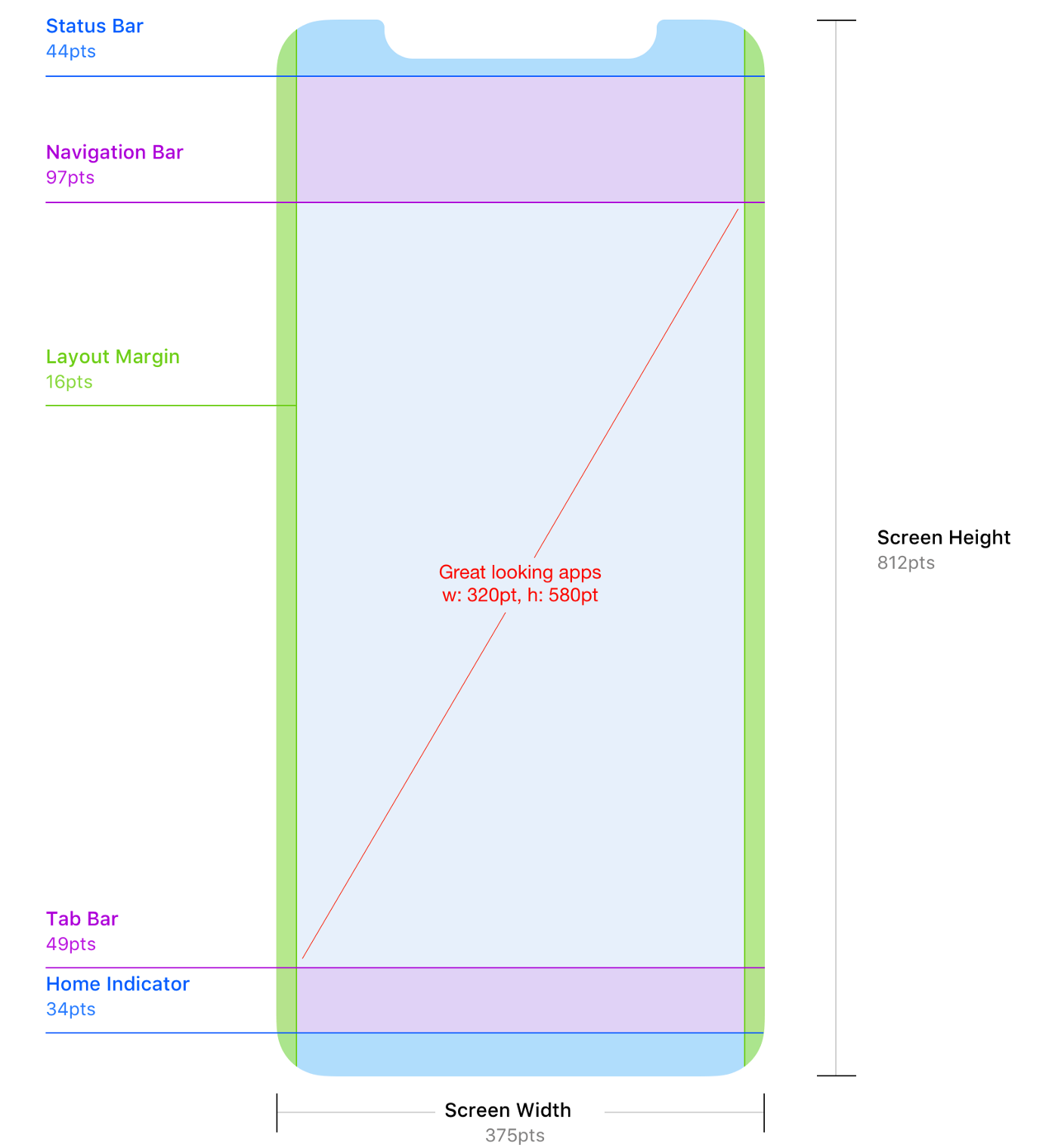
What does this mean in practical terms? Not all the screen is the same and not all screen areas can be used for the same thing. Let’s give it a look.
-
The BLUE and the GREEN area indicate zones that would hardly be used, except for showing those visual extension of outbound lights (remember Philips’s TV at the very beginning of the article?).
-
The PURPLE zone indicates a useful screen area for navigation and control tools.
-
The RED zone indicates the area where our application should be more responsive and concrete: the heart of the app where users should direct their eyesight, attentions and taps.
Let’s try, for example, to see how Apple’s engineers have been applied this concept to contacts application on iPhone X. To make things more clear lets overlap the graph above on the contacts screen.
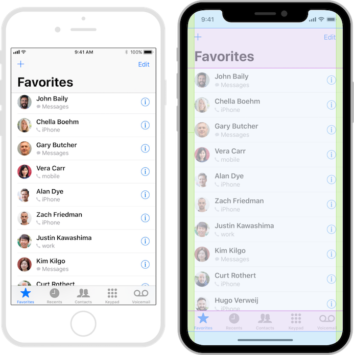
In this case, the concept we tried to express above seems to be exactly the same used by the engineers who worked on the contact application provided with iOS11; the main area reflects the safe area (the one where to direct the attention and the touches). All other areas have a more peripheral contribution, to “complement” the user experience. Awesome.