Among the standout announcements from WWDC25, one of the most impactful is without a doubt Apple’s new design system, paired with a reimagined user experience and fresh interface paradigms.
We’re talking about Liquid Glass — Apple’s latest design language unveiled in early June. This new system effectively unifies the entire suite of Apple operating systems under a single visual paradigm. The goal? To ensure unprecedented continuity and fluidity across iOS, macOS, iPadOS, watchOS, visionOS, and even tvOS.
To truly grasp the scale of this shift, it’s useful to take a step back in time — all the way to 2007, when the very first iPhone was introduced.
The Origins of Skeuomorphism
To bring that revolutionary device to life — a smartphone made almost entirely of a 3.5-inch touchscreen — Steve Jobs and his team opted for a visual interface grounded in skeuomorphism. This was a deliberate decision from Jobs himself, who believed it was critical to give users the sense they were interacting with familiar, now-touchable objects. Skeuomorphism uses graphical elements that mimic real-world items to create instant recognizability.
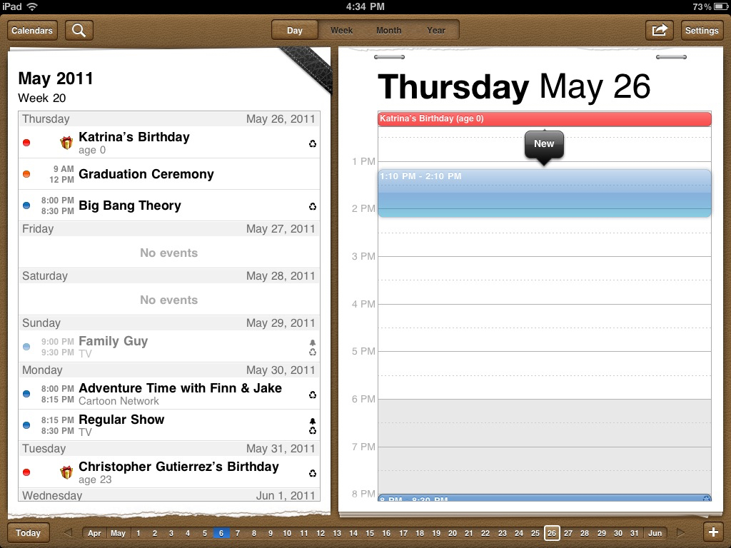
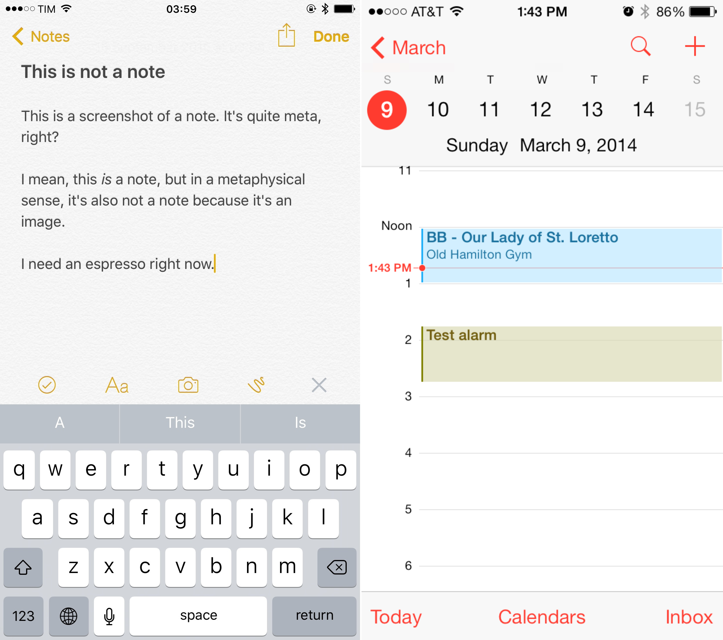
The calculator looked like a physical calculator; the Notes app featured yellow ruled lines like a real notepad; the Calendar resembled a leather-bound planner. Every detail was crafted to make interaction feel as intuitive as possible.
At the time, no one had ever used a fully touch-based smartphone. Competing devices clumsily combined screens with physical keyboards. Jobs wanted something radically different, and skeuomorphism proved a winning idea. Buttons appeared three-dimensional, complete with shadows and highlights, encouraging users to tap. No stylus, no physical keys — just tap, swipe, and pinch.
The term skeuomorphism originates from Greek:
-
σκεῦος (skeuos) = tool, vessel
-
μορφή (morphē) = form
In essence: “an object that retains the appearance of an older or more familiar object, despite serving a modern and different function.”
The physical world offers plenty of analogies: ceramic vases that mimic metal, concrete pillars styled after marble, decorative buttons on jackets that no longer fasten anything but recall functional closures.
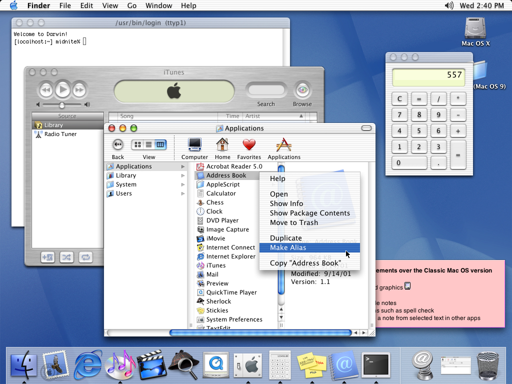
By the 1980s, the concept had entered the digital world. As graphical user interfaces emerged, designers sought a visual language that could resonate with millions of new users. Apple was among the first to adopt this approach: folder icons, the Trash bin, even the Finder™ were early skeuomorphic elements. These evolved in the early 2000s into the now-iconic AQUA interface of MacOS X.
Skeuomorphism didn’t originate with the iPhone — but it found its fullest expression there, thanks in large part to Scott Forstall under Jobs’ leadership, who between 2007 and 2009 solidified its presence in iPhoneOS.
Many agree that the early success of the iPhone was largely owed to this revolutionary visual choice. The skeuomorphic interface reigned for six years, maturing and becoming a reference point for independent developers who, during that golden age of the App Store, produced apps of remarkable quality.
The Rise of Jony Ive’s Minimalism
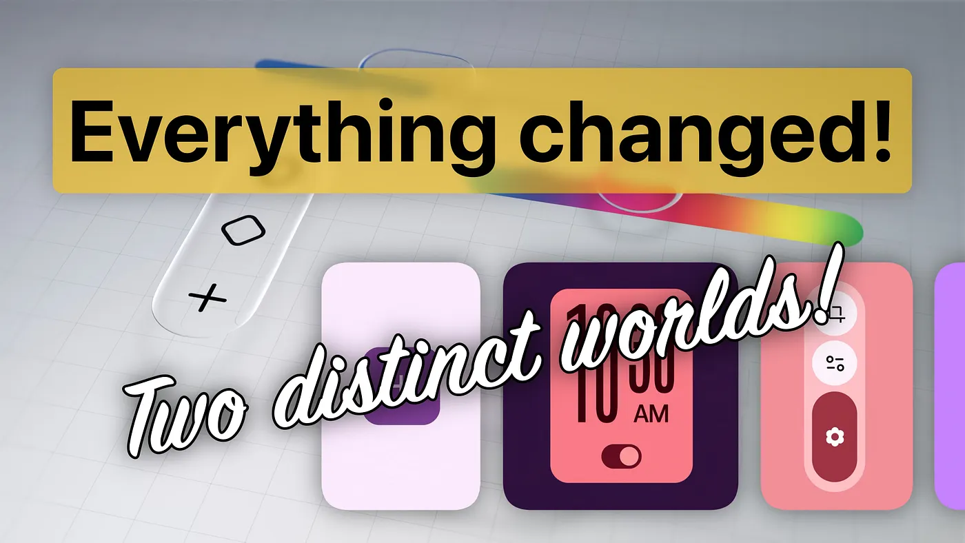
In 2013, with iOS 7, Apple abandoned skeuomorphism in favor of a flat, minimalist design language introduced by Jony Ive. Everything became two-dimensional, essential — and, at times, monotonous. The initial interface needed refinement: low contrast, ambiguous interactive elements, and overly saturated colors drew criticism. It took a few years before this new language evolved into something cohesive and appreciated.
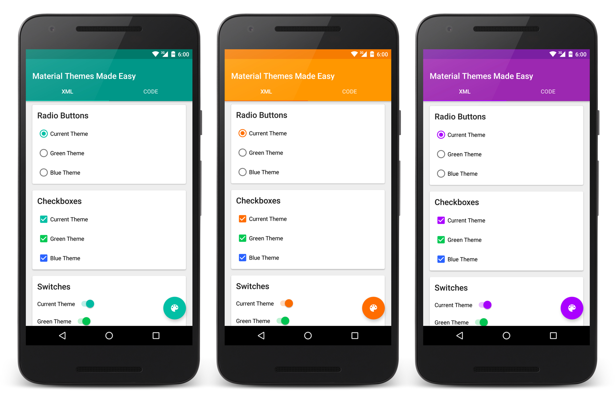
Apple wasn’t alone in this transition. Minimalist design found its way into other ecosystems too — first through Microsoft’s brief foray into mobile, and especially through Google’s Material Design, which expanded on the ideas of iOS 7. Over time, Apple would borrow several ideas back from Google to evolve its interface, culminating in the maturity now seen in iOS 18 — twelve years later.
Time for Change
Eighteen years after the iPhone’s debut, the devices we carry in our pockets are full-fledged computers, with capabilities once thought impossible. Minimalist interfaces — even when enhanced with animations and transitions — now feel overly simplistic for such advanced hardware.
That’s why Apple’s decision today makes perfect sense: sacrificing a small portion of processing power to make interfaces feel more alive, expressive, and ready for the spatial computing era. It marks the beginning of a new cycle.
Why the long backstory? Because Liquid Glass represents a shift comparable in magnitude to that of skeuomorphism. It borrows its core ideas, reinterprets them, and encapsulates them in a new symbolic material: glass.
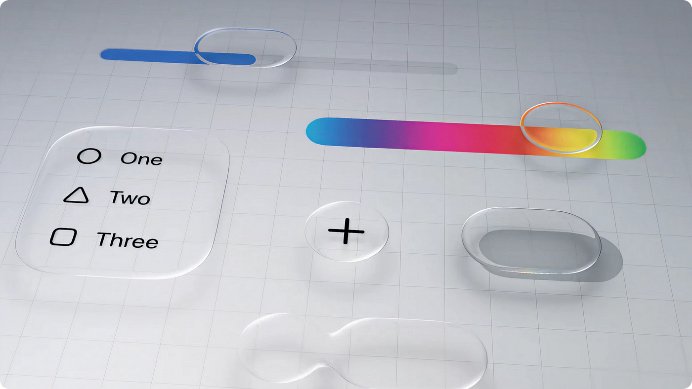
As Craig Federighi explained in an interview with the Wall Street Journal, glass is the perfect metaphor for an interface designed for spatial computing and augmented reality — based on the overlaying of layers. But to make those layers useful, you need a system that’s coherent, readable, and usable across both touch and non-touch devices.
Glass meets those needs: it’s transparent, reflective, fluid. It allows users to see through layers while maintaining focus on foreground elements — preserving environmental continuity.
This concept will take time to mature. But one thing is certain: Apple has chosen its direction — and done so with consistency. This fall, we’ll see its first concrete implementations.
Welcome, Liquid Glass.
—
Happy coding! 🖖🏻