We have seen that SwiftUI always requires to expose a body that returns a View. In the construction of complex views, however, it is necessary to compose these Views with a specific layout and return them in the form of a single object. To do this, SwiftUI comes to our aid through the Content View concept.
The basic objects with which we talk, such as Text that we saw in the previous chapter, adhere to the View protocol. There are other, more complex objects, that in the declaration of their API have a format similar to the following:
public struct VStack<Content> where Content : View
The above is the declaration of the VStack component that we will analyze during the rest of the article. If we look at the definition of Content, we will see that:
@_functionBuilder public struct ViewBuilder {
    ...
    public static func buildBlock<Content>(_ content: Content) -> Content where Content : View
    ...
}
Basically, objects like VStack use a ViewBuilder constructor to compose multiple View types together.
The ViewBuilder closure
The closure viewbuilder allows us to insert typically declarative instructions inside it: instead of invoking an addSubview method, as we did with UIKit, we will insert a list with all the views contained directly within the closure.
To better understand this concept, let’s take a closer look at the definition for the VStack struct:
public struct VStack<Content> where Content : View {
    public init(
        alignment: HorizontalAlignment = .center,
        spacing: Length? = nil,
        @ViewBuilder content: () -> Content
    )
}
The content parameter is defined as a closure () -> Content. The compiler knows this attribute implicitly marked as @ViewBuilder and knows how to transform it into a new closure that returns a view representing all the content declared within VStack.
This principle is present in all objects that expose a where Content: View clause
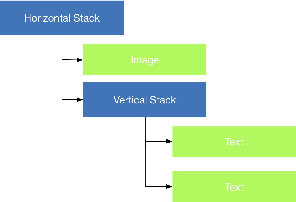
Stack View
A Stack View is a special View of kind Container View that allows us to return a composition of other View objects, according to a vertical, horizontal or depth layout.
Continuing our comparisons with the UIKit framework, the corresponding object that we will analyze in this paragraph, are the UIStackView. In SwiftUI, however, apart from the basic concept there is very little of the classic UIStackView.
Stacks objects currently available are of three flavours: HStack, VStack and ZStack. Respectively: Horizontal Stack, Vertical Stack and Depth Stack (Z indicates the depth dimension).
These objects together with the modifiers we saw in the previous chapter, allow us to completely replace the concept of Auto Layout and Constraints. From a technical point of view, this greatly increases the responsiveness and the rendering speed of the application, because the system does not need to pre-calculate any specific constraint or layout: everything is declared a priori, in a full declarative style.
In code, we’ll write something like this:
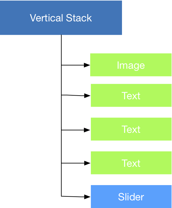
import SwiftUI

struct ContentView : View {
    var body: some View {
        VStack {
           Image( ... )
           Text( ... )
           Text( ... )
           Text( ... )
           Slider( ... )
        }
    }
}
As you can see, unlike UIKit, references to methods like addSubview are no longer present. In SwiftUI, views are created entirely with a process of declarative composition of the structures. Simply, let’s say to the compiler that our ContentView has inside a VStack container with inside: Image, Text, Text, Text and Slider.
We are not paying attention to individual factory methods for now. We will have time to return to slider images and advanced controls immediately ahead. For now, the important thing is to understand exactly what is happening and why.
A very important note relative to ViewBuilder regards the syntax to be used in it. Even if we are in the presence of Swift, in fact, within this closure it is not possible to use some typical operators to which we have been accustomed, such as the optional unwrapper:
...
VStack {
    if let anImage = anImage {
       Image( ... )
    }
    Text( ... )
    Text( ... )
    Text( ... )
    Slider( ... )
}
This code will produce a compilation error. The ViewBuilder closure cannot - for now - correctly parse the optional unwrapping concept. The following code, on the other hand, works correctly:
...
VStack {
    if anImage != nil {
       Image( ... )
    }
    Text( ... )
    Text( ... )
    Text( ... )
    Slider( ... )
}
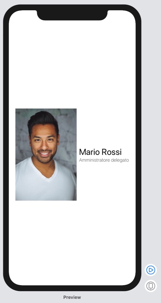
Build a custom TableViewCell
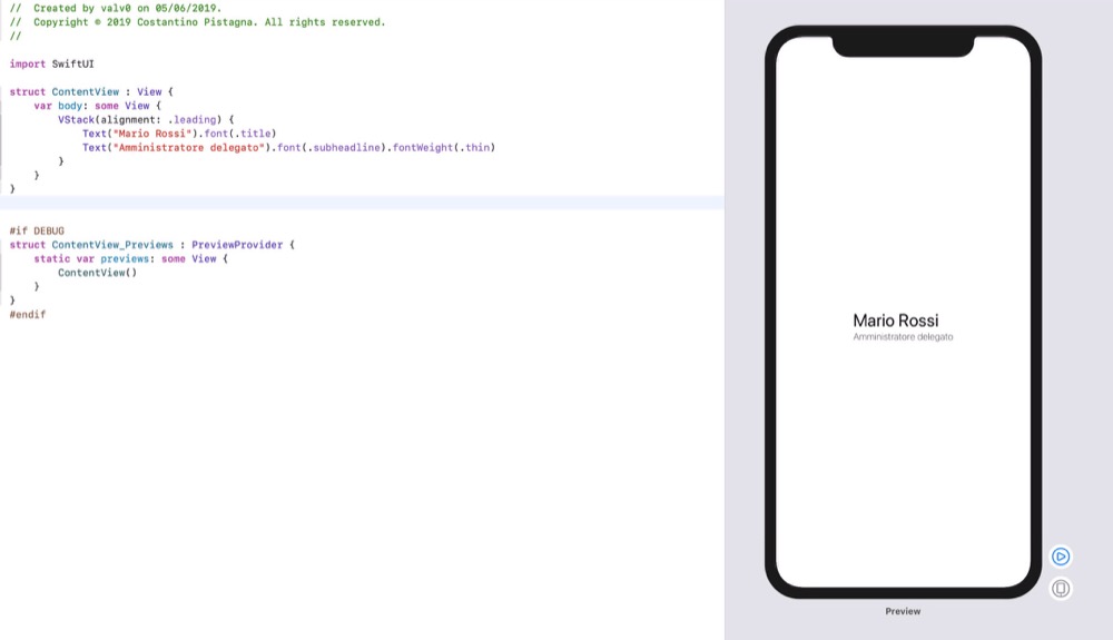
Since the easiest way to learn a new tool is to go to practice, in this section we will try to replicate the typical behavior of a UITableViewCell with title and subtitle. The result we would like to achieve is something like this:

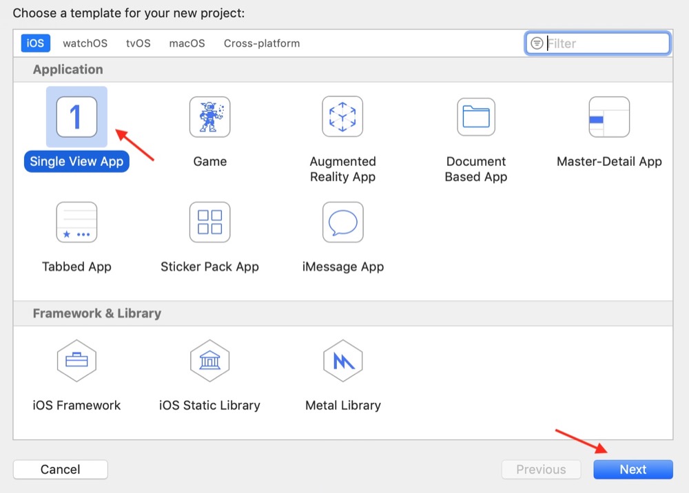
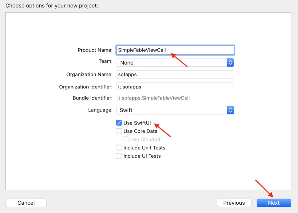
First thing to do is to create a new project that includes support for SwiftUI:
We will now replace the ContentView struct provided by default with the following code:
struct ContentView : View {
	var body: some View {
		VStack(alignment: .leading) {
			Text("Mario Rossi").font(.title)
			Text("Amministratore delegato").font(.subheadline).fontWeight(.thin)
		}
	}
}
At this point in the Preview Canvas pane, you should see the result of your statements appear magically:
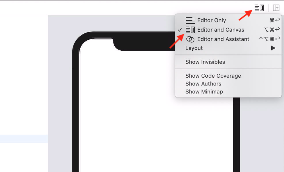
If you don’t see anything, first make sure you’re in a MacOS Catalina 10.15 environment, the Live Preview system, works exclusively on this environment. If you are already in 10.15 but you still don’t see the live preview, make sure you have enabled the Canvas panel as follows:
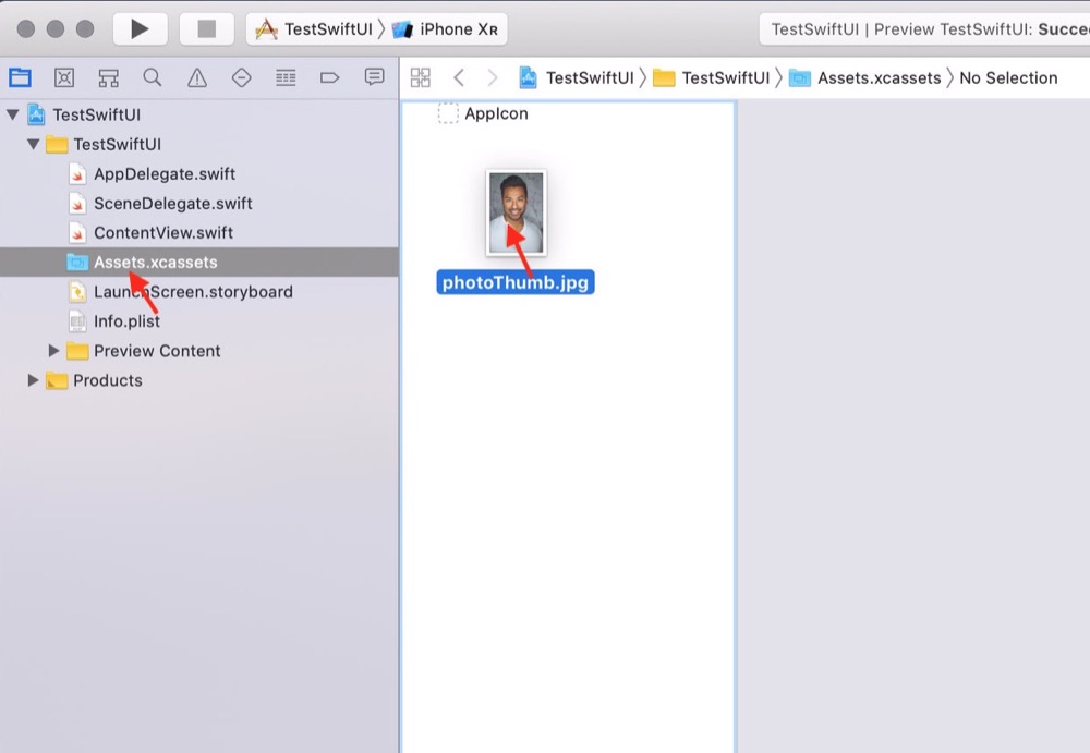
Simple? You bet! We still lack some elements to complete our work. The first thing is the image. Download the reference image that you find at the bottom of the article and, taking care to select the Assets.xcassets folder of your project, drag the image you have just downloaded into it.
The Image object
Every framework must have the possibility to dialogue in a more or less complete and complex way with images. SwiftUI offers a truly formidable support for this type of objects that will not make us regret even its cousin UIImageView.
Image is a View object (the result is an object adhering to the View protocol). In its most basic form, we supply the name of an image to display:
Image("photoThumb")
The result is the a View with the image provided as an argument. If we try to insert this instruction inside the VStack:
...
VStack(alignment: .leading) {
    Image("photoThumb")
    Text("Mario Rossi").font(.title)
    Text("Amministratore delegato").font(.subheadline).fontWeight(.thin)
}
...
result will not be exactly what was hoped for:
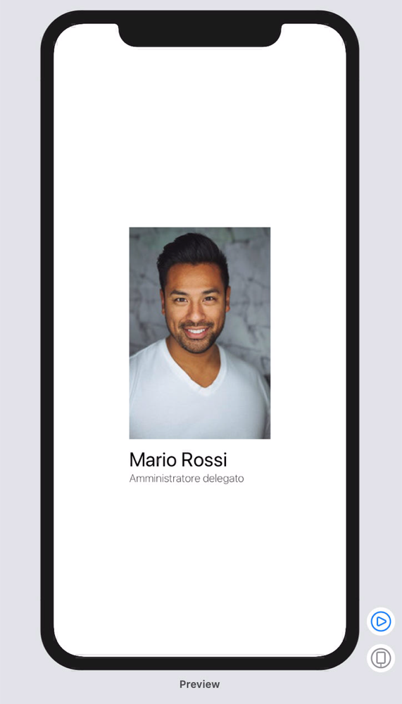
Lets try to solve this problem. The first thing to do is to align the image horizontally with the rest of the content. Remember when we were talking about VStack?
His job is to vertically align the list of items provided in his ViewBuilder block. It is clear, therefore, that it is necessary to slightly change the diagram of the views on which we are working on, taking care to add an additional variant of Stack provided by SwiftUI: HStack.
struct ContentView : View {
    var body: some View {
        HStack {
            Image("photoThumb")
            VStack(alignment: .leading) {
                Text("Mario Rossi")
                    .font(.title)
                Text("Amministratore delegato")
                    .font(.subheadline)
                    .fontWeight(.thin)
            }
        }
    }
}
Much better!
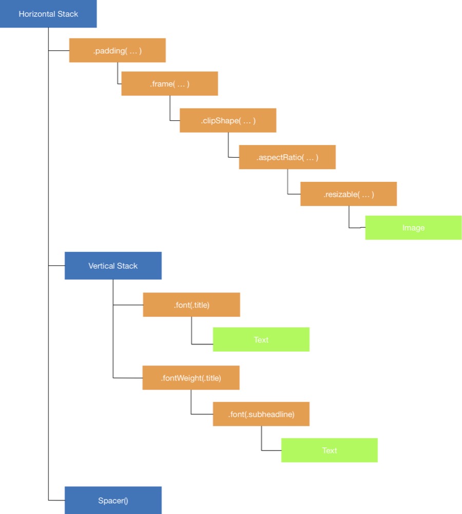
We still have to adjust the shape and size of the image. The first thing I want to do is tell our image that it should be resizable and keep its aspectRatio.
...
Image("photoThumb")
    .resizable()
    .aspectRatio(contentMode: .fit)
...
Then I would like to give it a circular shape and force its size to 60pt:
...
.clipShape(Circle())
.frame(width: 60, height: 60, alignment: .center)
...
and, finally, I would like to add some padding from the left, let’s say 20points:
...
.padding(EdgeInsets(top: 0, leading: 20, bottom: 0, trailing: 0))
...
All together:
struct ContentView : View {
    var body: some View {
        VStack {
            HStack {
                Image("photoThumb")
                    .resizable()
                    .aspectRatio(contentMode: .fit)
                    .clipShape(Circle())
                    .frame(width: 60, height: 60, alignment: .center)
                    .padding(EdgeInsets(top: 0, leading: 20, bottom: 0, trailing: 0))
                VStack(alignment: .leading) {
                    Text("Mario Rossi").font(.title)
                    Text("Amministratore delegato").font(.subheadline).fontWeight(.thin)
                }
            }
        }

    }
}
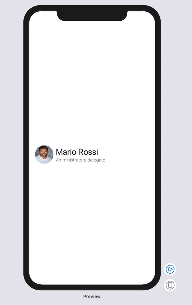
The Spacer object
At this point our CustomTableView seems to be complete but a small problem still persists: it seems to be aligned to the center rather than to the left.
The problem is related to the fact that Stacks by default - I remember that the main one we are working on expands horizontally (HStack) - are designed to take all the space available on their main axis, dividing it equally between the children.
Therefore, to be able to align the entire object on the left it is necessary to add an additional neutral view called Spacer. The View Spacer is a flexible view that expands automatically throughout the main axis of the stack in which it is inserted. We will add this View as the last element of our horizontal stack:
struct ContentView : View {
    var body: some View {
        VStack {
            HStack {
                Image("photoThumb")
                    .resizable()
                    .aspectRatio(contentMode: .fit)
                    .clipShape(Circle())
                    .frame(width: 60, height: 60, alignment: .center)
                    .padding(EdgeInsets(top: 0, leading: 20, bottom: 0, trailing: 0))
                VStack(alignment: .leading) {
                    Text("Mario Rossi").font(.title)
                    Text("Amministratore delegato").font(.subheadline).fontWeight(.thin)
                }
                Spacer()
            }
        }

    }
}
Here’s how our preview will look, once the job is complete:
Note: current version of Xcode11 contains a known problem that does not correctly resize the image when using the .fit option getting, instead some sort of stretch effect on the content.
In the next chapter, we will see some rules of good conduct that try to make the code as minimal and compact as possible, adopting subviews extraction techniques. We will also see an introduction to passing parameters and how SwiftUI manages the status of its elements.
– 🖖🏻