Liquid Glass vs Material 3: The End of Convergence in Mobile Design
Apple's Liquid Glass and Google's Material 3 Expressive pull mobile design apart, ending years of convergence and forcing new choices on app developers.
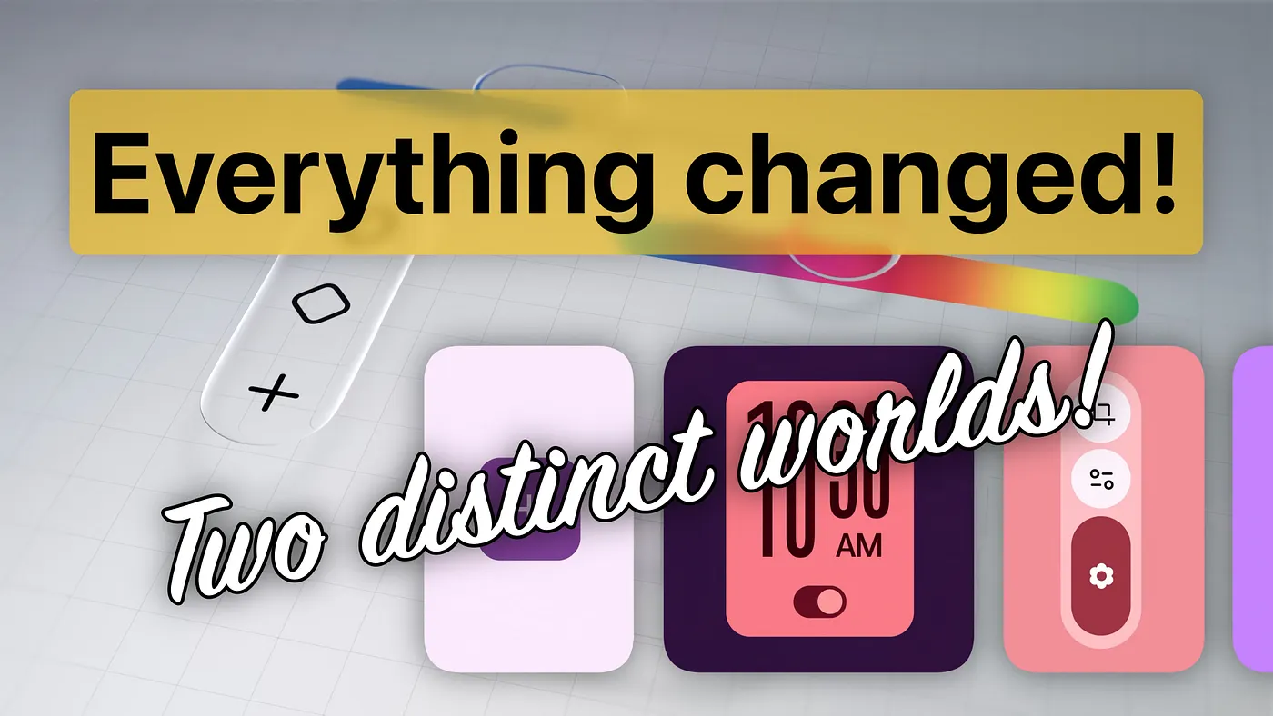
2025 has forever changed the aesthetics of the mobile world.
Apple unveiled Liquid Glass, a digital meta-material bringing transparency, refraction, and dynamism to iOS, iPadOS, and macOS.
Google responded with Material 3 Expressive, the evolution of Material You, built around bold colors, variable typography, and elastic animations.
Two visions that couldn’t be more different. And with them, the end of an era: the era of aesthetic convergence.
A Step Back: When Paths Seemed Aligned
To understand the significance of today’s divergence, we need to go back more than a decade.
With iOS 7 (2013), Apple permanently shelved skeuomorphism: goodbye to wood and leather textures, hello to thin typography, flat surfaces, and subtle transparency.
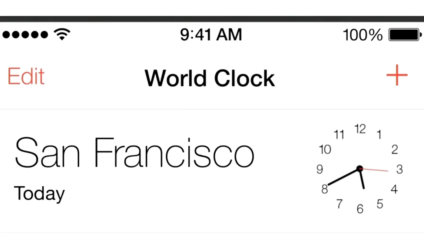
Just a year later, Google introduced Material Design, a visual language inspired by “digital paper”, capable of moving and gaining depth through shadows and elevation.
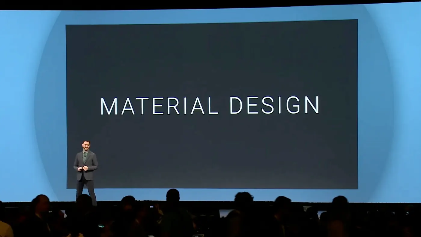
At that moment, the two paths seemed parallel. Minimalism, clarity, and motion design were shared values, and for third-party developers, it finally looked possible to imagine a consistent cross-platform experience.
The Illusion of Neutrality
The aesthetic convergence of those years fueled tools like Flutter or React Native, which could offer interfaces that looked at home on both iOS and Android.
But adoption was uneven: Android’s fragmentation slowed the spread of Material Design, while iOS’s stricter guidelines accelerated alignment.
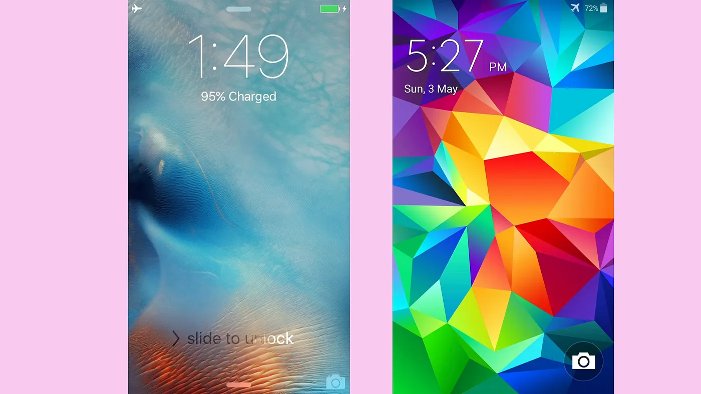
For years, the impression was that of a nearly universal visual language. But today, the trajectory has shifted, a lot.
Liquid Glass: Apple Bets on a Sensory Future
With Liquid Glass, Apple moves beyond flat minimalism: three- dimensional surfaces, light refraction, dynamic transparency.
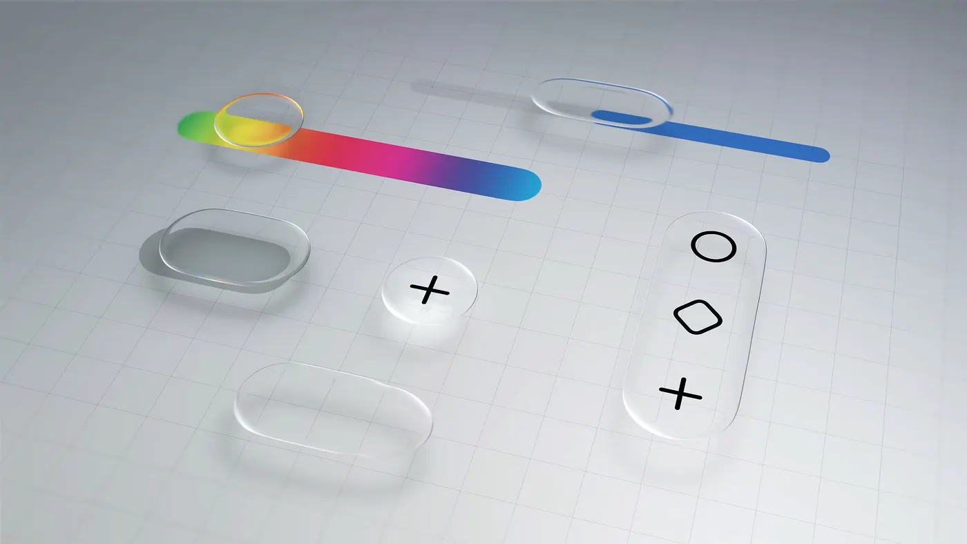
It’s an aesthetic clearly pointing toward the future of spatial computing and continuity with visionOS, weaving a direct thread between smartphone, tablet, desktop, and headset.
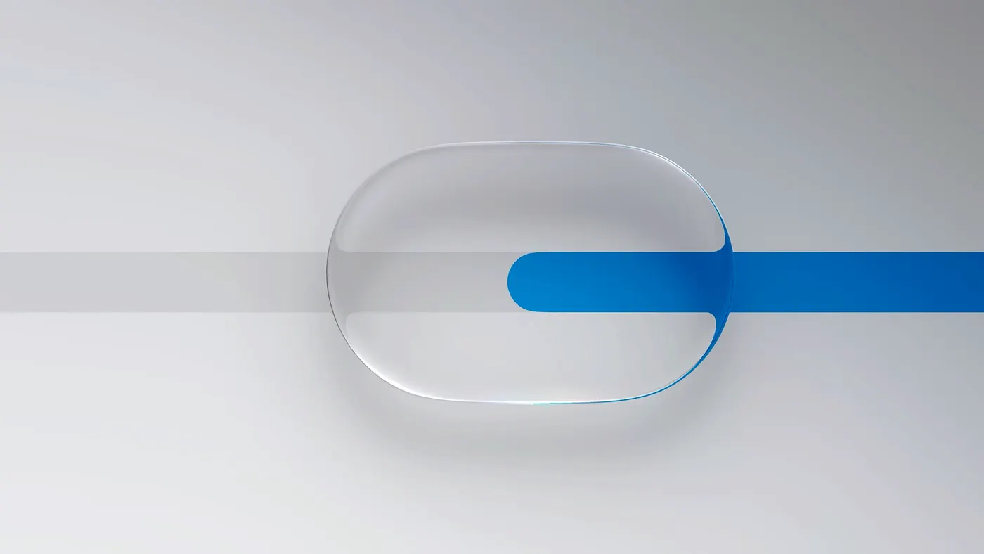
A sensory, almost physical design language — one built for the long term.
Material 3 Expressive: Google’s Take on the Present
Google, in contrast, pushes its visual language forward with Material 3 Expressive, embracing a bolder, more immediate direction.
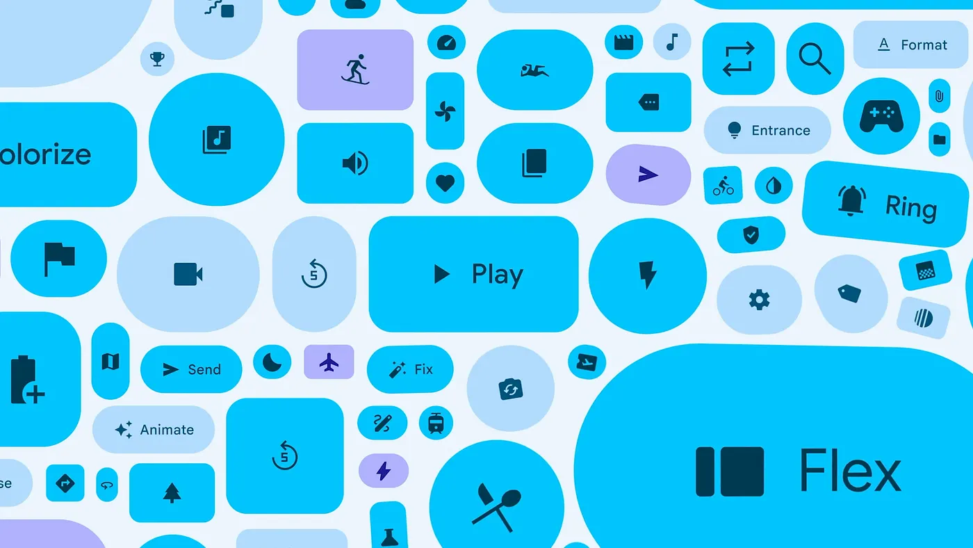
Saturated colors, variable typography, elastic animations: an aesthetic that speaks to Gen Z, emphasizing accessibility and visual impact in the short term.
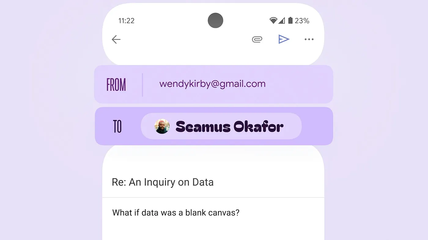
Not the future of the metaverse or mixed reality, but a lively, everyday, and inclusive design system.
Consequences for Developers and Brands
This divergence is more than just a shift in style — it marks the end of neutrality for app development.
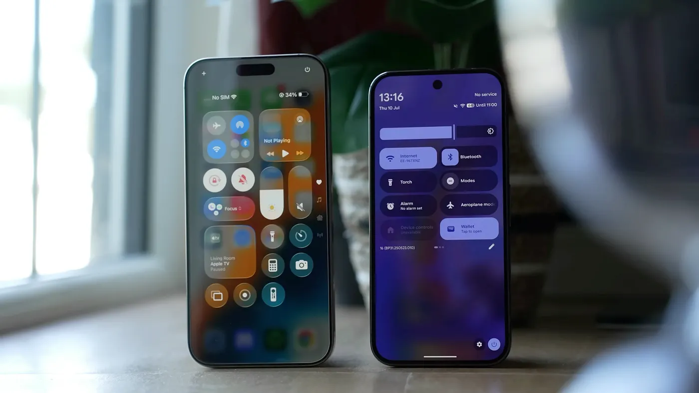
The choices are now threefold:
- Native UI with shared logic → maximum aesthetic fidelity to each platform’s guidelines.
- Adaptive cross-frameworks → branching and skinning to respect stylistic differences.
- Brand-first approach → increasingly chosen by major players, imposing their identity above OS rules.
In other words, the challenge is no longer writing a single codebase, but translating one design system into two different dialects — without losing coherence or usability.
A New Aesthetic Competition
Liquid Glass and Material 3 Expressive embody two opposite philosophies:
- Apple bets on the future, with a sensory interface paving the way for spatial computing.
- Google optimizes the present, with vibrant, accessible design tuned for today’s users.
For users, this means experiences ever more defined by their chosen ecosystem.
For developers, it means making sharp, unavoidable choices about whether to adapt — or differentiate.
Once again, design is not just aesthetics. It is competitive strategy.
— Happy coding! 🖖🏻